Project Overview
Problem: Searching for a therapist can be daunting as there's a lot of criteria and factors that going into finding the best match. Finding a therapist can be time consuming and scary.
The goal:
To ease the stress of finding a therapist and find better matches between patients and therapists. The goal is to also provide resources on mental health all in one spot.
In this case study, I chose to create an app where individuals can search for therapists and schedule therapy sessions at their convenience. I was able to:
- Identify an idea for social good
- Identify pain points
- Design paper and Digital wireframes
- Create a Low-fidelity prototype
- Perform a usability study
- Create a High-Fidelity prototype
- Consider Accessibility within UX design
- Evaluate takeaways and next steps
I've developed a deeper knowledge with the UX design process and how to use tools like Figma. I was able to explore new design aspects and test out a variety of different styles to see which fit best.
Understanding the User
User Research:
The primary user group identified through research was teens to mid-aged adults. A lot of individuals need to look for a therapist but don’t know how to go about it. They are in need of an accessible, easy to use platform that they can search for therapists based on the criteria they need.
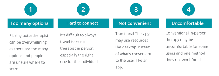
User Pain Points:
User Journeys:
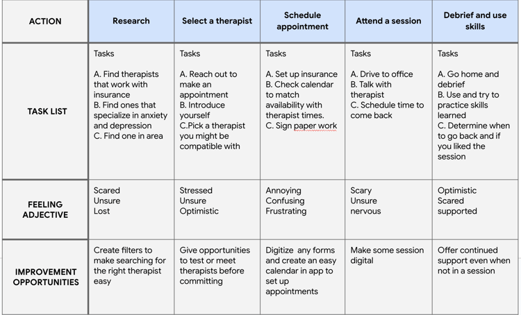
Chris's Goal: Find a therapist to talk to about mental health
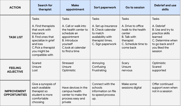
Caroline's Goal: Find a therapist while at school with a busy schedule
Starting the Design
Paper Wireframes:
This is the first paper wireframe daft for the Therapist app. I tested with eight wireframe sketches to get ideas of different screen iterations within the app. Each section highlights different therapist options and ways to filter through the data.

Digital Wireframes:
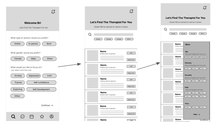
Next, I created the best design from the paper wireframes in Figma and made sure I had all elements that would allow a user to search and filter for therapists.

Low-fidelity Prototype:
I created a low-fidelity prototype in Figma to tie together the screens and create a user flow. Link to Figma here.
Usability Study:
I had five users test the low fidelity prototype and give me suggestions. They are as follows:

Refining the Design
Taking the findings above, I created themes and used those to refine my design.
Theme: Confusion around the ‘More’ option. It blends in with the other applied filters. The fix was to change the style and remove the bubble.
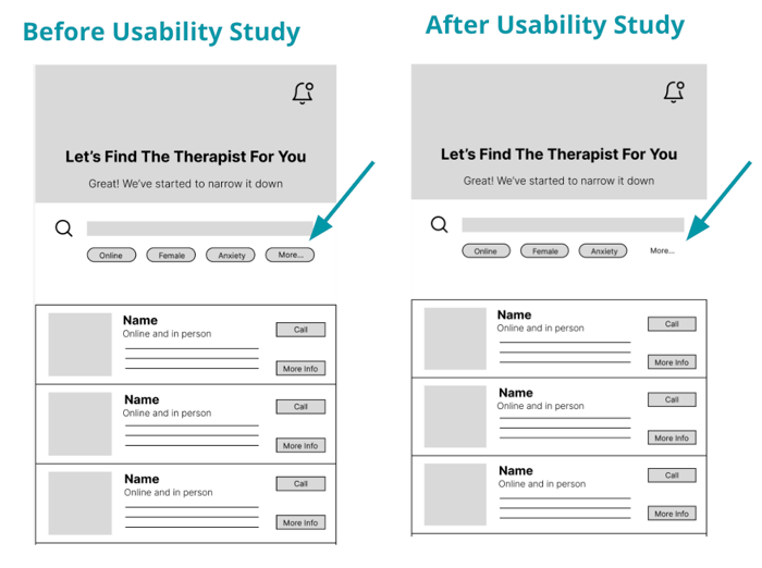
Key Mockups:
I implemented all design and prototype updates after my user testing.
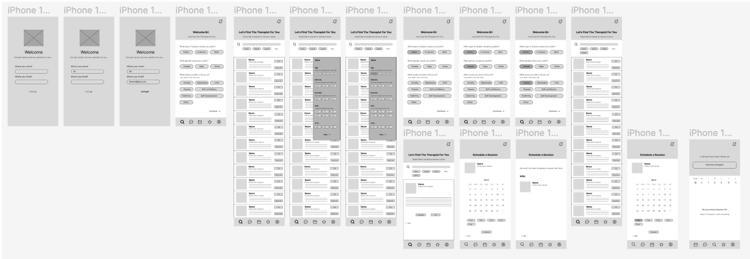
High-fidelity prototype:
I took suggestions from the user testing and edited the mockups and prototype to create a high-fidelity prototype. Figma link here.

Different Screen Size Mockups:
Started designing from small screens to larger screens. Desktop, Tablet, and Desktop.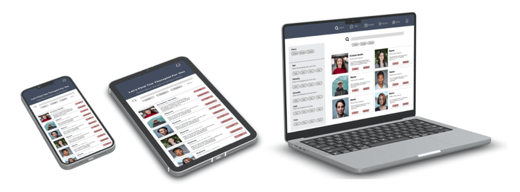
Accessibility Considerations

Next Steps:

Takeaways
Impact:
This app will allow users to seamlessly search and find a therapist suitable to their needs. The app will provide easy follow up appointment scheduling and other mental health resources all in the same place.
What I learned:
I learned how to identify key pain points and translate them into actionable design solutions. I also really learned how to navigate Figma better and design more efficiently. I was able to ask the "why" behind the design and figure out what elements would be needed to accomplish the customer's goal and user journey.
